How to Analyze Basketball Shot Charts Effectively
Key Takeaways
Learning how to analyze basketball shot charts helps you evaluate player performance and shape team strategy.
Shot charts reveal scoring patterns and shooting efficiency at a glance.
Advanced metrics like True Shooting Percentage (TS%) make shot chart analysis more accurate.
Combining video film with shot chart data gives you a fuller picture of any player.
Analytics platforms like Scouting4U simplify the entire process.
Introduction: Why You Need to Know How to Analyze Basketball Shot Charts
If you coach, scout, or manage a basketball team, knowing how to analyze basketball shot charts is one of the most practical skills you can develop. Shot charts show you where players shoot from, how often they shoot from each zone, and what percentage they convert. That information alone can change how you build an offense, defend a star player, or evaluate a recruit. This guide walks through the full process - from reading a basic shot chart to applying advanced metrics and integrating video. By the end, you will have a clear method you can use immediately.
Understanding how to analyze basketball shot charts is no longer optional at the professional or high-level college game. Teams that use this process systematically make better decisions in practice, in games, and in the transfer portal. This guide gives you that process step by step.
What Is a Basketball Shot Chart?
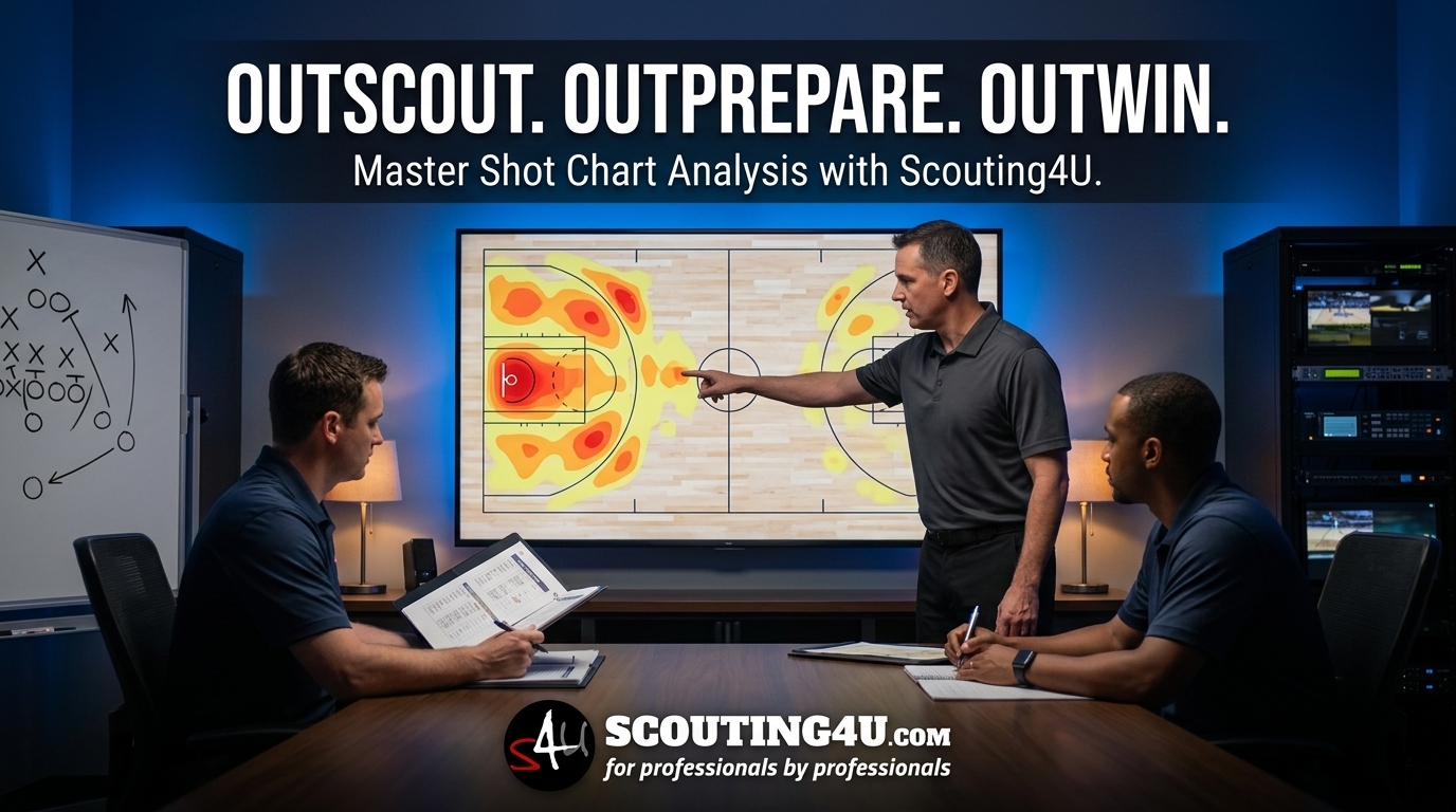
A basketball shot chart is a court diagram with plotted markers showing every shot attempt in a game, a series, or an entire season. Each marker tells you the location of the shot. Color coding or symbols then tell you whether the shot went in. Green dots or solid circles often mean made shots. Red dots or open circles often mean misses. Some charts also include shot frequency data - darker zones mean more attempts from that spot.
Shot charts come in several forms. A basic chart shows raw made and missed attempts. A zone chart breaks the court into regions like mid-range, corner three, and paint, then shows efficiency percentages for each area. A heat map uses color gradients to show where a player shoots most often. Each format answers a slightly different question, so knowing how to analyze basketball shot charts means knowing which format fits the question you are asking.
How to Analyze Basketball Shot Charts: The Core Process
Learning how to analyze basketball shot charts starts with a simple four-step process. Work through these steps every time you pull up a new chart.
Step 1 - Identify the shooting zones. Break the court into meaningful areas: paint, mid-range (elbow, baseline, wing), corner three, above-the-break three. Each zone has a different expected value. A corner three is worth more per attempt than a long two from the elbow. That basic math shapes how you interpret every number you see.
Step 2 - Check volume vs. efficiency together. A player might shoot 70% from the right elbow - but if he only took three shots from there all season, that number tells you very little. You need both volume and percentage before you draw conclusions. High volume and high efficiency from one zone is a real strength. High efficiency on low volume might just be a small sample.
Step 3 - Compare to league or opponent averages. Context matters. A 38% three-point rate looks different when the league average is 36% than when it is 40%. When you learn how to analyze basketball shot charts properly, you always benchmark individual data against a relevant comparison group - whether that is the full league, a conference, or a specific opponent.
Step 4 - Look for tendencies, not just totals. Does the player always drift left after ball screens? Do they prefer pull-up threes over catch-and-shoot attempts? Shot charts, when read carefully, show habits. Those habits are what coaches game plan for and what scouts document in reports. For a deeper look at documenting those patterns, see our guide on basketball tendency analysis and decoding opponent patterns.
Reading Zone Data and Efficiency Numbers
Once you understand the structure of a chart, the numbers become much easier to interpret. Here is what to watch for in each major zone.
The paint is the highest-efficiency zone on the court. Any player attempting less than 50% inside the paint is either taking contested shots or struggling with finishing. Check whether paint attempts come off drives, post-ups, or cuts - the source matters for how you build plays around that player.
Mid-range shots get criticized in modern analytics because the expected value is lower than a three-pointer or a paint shot. But mid-range efficiency varies enormously between players. A player hitting 48% from the elbow is still producing above the break-even threshold. When you know how to analyze basketball shot charts, you do not dismiss mid-range data - you just weigh it correctly.
Corner threes deserve special attention. The corner three is the shortest three-point shot on the court, which is why catch-and-shoot specialists often show their best percentages there. If a player shoots 40%+ on high corner three volume, that is a real weapon. If they avoid the corner entirely, that tells you something about their off-ball habits.
Above-the-break threes cover a wide area. A player who shoots well from the left wing but poorly from the right wing has a directional tendency you can exploit on defense or protect on offense. Knowing how to analyze basketball shot charts at this level of detail is what separates a basic read from a real scouting advantage.
Integrating Advanced Metrics Into Shot Chart Analysis
Raw percentages only go so far. Advanced metrics give you a more complete read on shooting efficiency. When you know how to analyze basketball shot charts at a deeper level, you pair chart data with these numbers.
True Shooting Percentage (TS%) accounts for two-point field goals, three-point field goals, and free throws in a single efficiency number. The formula is: Points / (2 × (FGA + 0.44 × FTA)). A TS% above 58% is considered strong at most levels. Use TS% alongside shot chart zone data to see whether a player's overall efficiency matches what the chart suggests.
Effective Field Goal Percentage (eFG%) adjusts for the extra value of three-pointers. Two players can have the same raw FG% but very different eFG% if one shoots more threes. Shot charts become clearer when you apply eFG% to zone-specific data.
Usage Percentage (USG%) tells you what share of team possessions a player uses. A high-usage player shooting 45% eFG% is more impressive than a low-usage player at the same rate. Shot charts show where the shots happen - USG% tells you how much that player drives the offense.
Points Per Shot (PPS) is a simple but effective number. Divide total points scored from a zone by total attempts from that zone. A player scoring 1.2 points per shot from the corner three and 0.8 from the mid-range has a clear preference you should lean into. For more on using analytics frameworks in player evaluation, read our article on mastering basketball analytics for coaches.
Shot Chart Analysis for Defensive Scouting
Most coaches use shot charts for offensive planning. Fewer use them as aggressively on the defensive side - which is an opportunity. When you know how to analyze basketball shot charts for defensive purposes, you can disrupt opponents more effectively.
Pull up a shot chart for the player you will be guarding. Find their highest-volume, highest-efficiency zones. Then plan to take those zones away. If a shooting guard converts 46% from the right wing but only 31% from the left, shade him left on every pick-and-roll. He will either take low-percentage shots or pass out of his comfort zone.
Team shot charts work the same way. If an opponent generates 40% of their points from corner threes, your defensive scheme should close out hard on corner shooters. If they rarely shoot mid-range and rely on layups, your rim protection becomes the priority. Knowing how to analyze basketball shot charts for defense is just as useful as using them offensively - arguably more so, because fewer teams do it well. For a structured approach to this process, see our full breakdown of basketball defensive scouting and identifying weaknesses.
How to Analyze Basketball Shot Charts for Recruitment
Shot chart analysis is not just for in-season coaching. Scouts use it heavily during recruitment to identify players who fit a specific system. When you apply how to analyze basketball shot charts to recruitment, you are asking one main question: does this player's shot profile fit what we need?
A team that runs a lot of pick-and-roll needs a ball handler who shoots well off the dribble from mid-range and above-the-break three. A team building around a dominant post player needs floor spacers who shoot high percentages from corner and wing threes. Shot charts let you confirm whether a prospect fits that profile before you watch hours of film.
Combine shot chart data with tendency analysis to build a full picture. A player might show a good three-point percentage on their chart, but if most of those makes came on wide-open catch-and-shoot attempts, they may struggle when contested at a higher level. Context from video fills that gap. This is exactly why the process of how to analyze basketball shot charts for recruiting should always end with a film session, not start with one.
For a full guide on applying data to recruitment decisions, check out our resource on data-driven basketball recruitment for front offices.
Combining Shot Charts With Video Analysis
Shot charts show you what happened. Video shows you why. Together, they are far more powerful than either tool alone. That combination is one reason why knowing how to analyze basketball shot charts now includes understanding how video tagging fits in.
When you tag video clips by shot zone - paint, elbow, corner three - you can pull every clip from a specific area instantly. You see the shot creation method, the defensive contest level, and the footwork. A player might show 42% from mid-range on their chart. Pull the video and you might see that 80% of those attempts came on quick pull-ups with a defender in their face. That context changes how you value that number.
Platforms like Scouting4U allow you to overlay video data with shot chart visualizations. You click a zone on the chart and the related clips load automatically. That workflow cuts analysis time significantly and makes it easier to build accurate scouting reports. The process of learning how to analyze basketball shot charts is much faster when your tools connect these data sources automatically. You can see how this works in practice by exploring the Scouting4U platform features.
Historical Examples: Shot Charts That Changed Strategies
The Houston Rockets under Daryl Morey became the most famous example of shot chart-driven strategy. Their analytics team identified that mid-range jumpers produced the lowest expected value on the court. The response was systematic: eliminate the mid-range entirely and concentrate attempts in the paint and at the three-point line. Between 2012 and 2019, the Rockets led the league in three-point attempts multiple times. Their shot chart looked unlike any other team in the NBA.
That approach has since influenced the entire league. Today, mid-range attempts as a percentage of all NBA shots have dropped sharply compared to the early 2000s. Teams at every level now ask their coaches and analysts to understand how to analyze basketball shot charts specifically so they can make the same kind of evidence-based strategic decisions the Rockets pioneered.
Individual players have also adjusted based on shot chart feedback. Several NBA veterans have publicly discussed eliminating low-percentage zones from their games after seeing their own charts. Shot chart data, delivered clearly, changes player behavior in ways that film sessions alone sometimes cannot. The ability to show a player exactly where they are losing value - zone by zone - is one of the strongest arguments for learning how to analyze basketball shot charts as a development tool.
Common Mistakes When Reading Shot Charts
Even analysts who know how to analyze basketball shot charts make a few recurring errors. Watch out for these.
Ignoring sample size is the most common mistake. A player who went 5-for-6 from the corner three in one game does not have an 83% corner three rate - he had one good night. Always check the total attempts behind any percentage before you act on it.
Treating all misses the same is another problem. A heavily contested three that misses is a different outcome than an open corner three that misses. Shot charts do not always capture contest level, which is why video integration matters.
Comparing players across different contexts without adjustment leads to bad conclusions. A player averaging 1.1 points per shot in a slow-paced, defense-heavy league looks different from a player posting the same number in an up-tempo, offense-first system. Know the context before you compare.
Skipping the tendency layer is a fourth mistake that is easy to make when you are new to this process. Knowing how to analyze basketball shot charts means going past the percentages to ask why those numbers look the way they do. That question is where the real decisions get made.
Conclusion
Knowing how to analyze basketball shot charts is now a baseline skill for coaches, scouts, and front office staff at every level. Shot charts tell you where players score, how efficiently they score, and where the vulnerabilities are on both ends of the floor. When you pair that data with advanced metrics and video, you get a clear and honest picture of player performance.
The process does not require a PhD in statistics. It requires a structured approach: identify the zones, check volume and efficiency together, compare to relevant benchmarks, and look for repeatable tendencies. Apply that process consistently and you will make better decisions - in game planning, player development, and recruitment alike.
The teams that have invested in learning how to analyze basketball shot charts are already seeing the results. They game plan more precisely, recruit more efficiently, and develop players with clearer targets. The gap between those teams and the ones still relying on gut feel is measurable - and it grows every season. Build this competency now, before it becomes standard everywhere and the advantage disappears.
Frequently Asked Questions
What is a basketball shot chart and what does it show?
A basketball shot chart is a court diagram that plots every shot attempt in a game or season. It shows the location of each attempt, whether the shot was made or missed, and often includes zone efficiency percentages. Coaches and scouts use shot charts to identify where players score most often and where they struggle. Learning how to analyze basketball shot charts starts with understanding what each format - basic chart, zone chart, or heat map - is designed to answer.
How do you start learning how to analyze basketball shot charts if you are new to analytics?
Start with zone efficiency data. Break the court into five or six zones and compare each player's field goal percentage in those zones to the league average. Once you are comfortable reading zone data, layer in advanced metrics like TS% and eFG% to get a more complete picture. Video integration comes after you have the basic framework down. The four-step process in this guide - zones, volume, benchmarks, tendencies - gives you a repeatable structure to follow.
How often should coaches review shot chart data during a season?
At minimum, review shot chart data weekly. Some coaching staffs update their analysis before every game, focusing on the upcoming opponent's recent shooting patterns rather than full-season averages. The more current the data, the more useful it is for game-specific decisions. Knowing how to analyze basketball shot charts on a rolling basis, rather than just at the start of a season, keeps your preparation sharper throughout the year.
Can shot charts be used to evaluate defensive performance as well as offensive performance?
Yes. Opponent shot charts - showing where teams score against a specific defense - are one of the best tools for evaluating defensive schemes. If an opponent is generating high efficiency from certain zones against your team repeatedly, that is a structural problem your shot chart data will expose quickly. Many coaches who understand how to analyze basketball shot charts offensively overlook how powerful the same data is on the defensive side.
What is the difference between a zone chart and a heat map in shot chart analysis?
A zone chart divides the court into fixed regions and shows efficiency percentages for each region. A heat map uses color gradients to show shot frequency - darker or more saturated areas indicate more attempts from that spot. Both are useful. Zone charts answer efficiency questions; heat maps answer volume and tendency questions. The best analysis uses both, which is why knowing how to analyze basketball shot charts means being comfortable switching between these two formats depending on what you need to know.
Enjoyed this article? Share it with others!
Founder & Lead Scout, Scouting4U
2x EuroLeague champion with 30+ years in professional basketball. Daniel won EuroLeague titles with Maccabi Tel Aviv, helped build the staff behind the 2007 European Championship, and has delivered 100+ professional scouting reports across 50+ leagues. If it happened in a European basketball front office, he was probably in the room. He founded Scouting4U in 2010 to bring championship-level scouting intelligence to every club.
No reviews yet. Be the first to share your experience!
Related Articles

Basketball Analysis: Elevate Game Insights with Video
Key TakeawaysSystematic video breakdown improves decision-making at every level of the game.Video tagging software makes...

Mastering Basketball Video Analysis for Coaches
Key TakeawaysBasketball video analysis helps coaches evaluate players and teams more accurately.Scouting4U offers advanc...

True Shooting Percentage Basketball: Calculation & Insights
Key TakeawaysTrue shooting percentage basketball offers a comprehensive efficiency metric that goes beyond simple field ...